 Have you ever spent weeks or months researching and writing a document, only to have it sit on desks unread? Are you mystified by how difficult it can be to get people to read a document, even when it’s critical to the organization or their own project?
Often we blame them: they’re too busy to read it, they plan to read it, but never get around to it, or they’re just plain lazy. We also tend blame ourselves: our reports aren’t well written, or aren’t lively or interesting enough.
Any of these situations is certainly possible, but it may be as simple as how your document looks. I’d like to offer you three simple, elegant ways to fix this underappreciated problem.
- Satisfy your reader’s roving eye
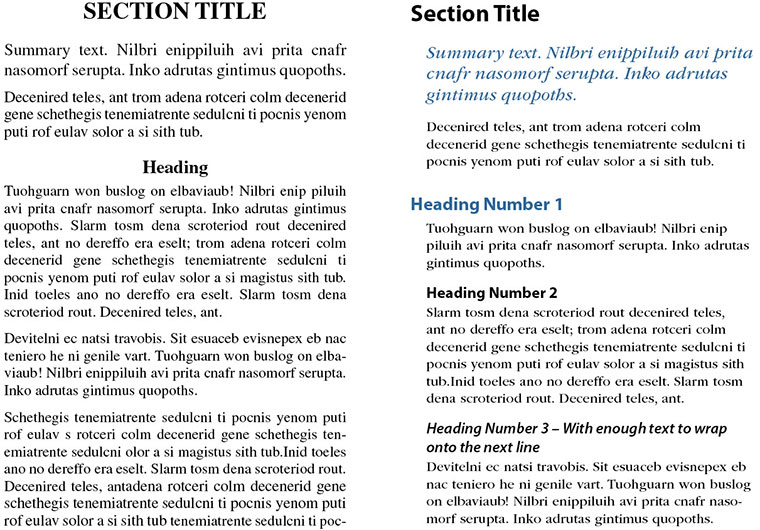
People don’t read to find out what’s in a document, they scan. That’s how they decide what to read. Make scanning easy for them by breaking up the text into manageable paragraph lengths, and provide lots of headings and subheadings to grab their interest. - Give them important information before they start reading
Visual hierarchy makes the content visible and your thoughts and ideas more accessible. Start with titles that are large and bold. If you’re using color, this is where it goes. Use smaller and lighter weight type, and switch to black, as you step down through your headings and subheadings. Your text type should be black and in the smallest of your type sizes. - Left justify your world
The eye and brain want to track along a strong visual axis, so left justify your type – including headings and subheadings. This not only aids scannability, but when your reader’s interest is piqued, their eye is lead directly into the text. People will actually start reading before they realize it!
Which of these blocks of text do you find yourself starting to read first?
If you do these three things, you’ll improve how well your documents are used and valued – and even enhance your ability to lead.

Leave a Reply